1.2 Exam Only: The java.awt package - Layout
Note that the second form, as far as the certification exam scope is concerned, is used with BorderLayout.
The String is one of "North", "South", "East", "West"
or "Center", which specifies which area of the component is to added to. However, the JDK documentation
strongly advises the use of the Java 1.1 form. Which is asked in the exam I can't say, but it is probably wise to be
familiar with both. The 1.1 form, which is the only one used in Roberts & Heller (Boone only uses the above form)
is as follows:
public void add(Component comp, Object constraints)
Adds the specified component to the end of this container. Also notifies the layout manager to add the component to this container's layout using the specified constraints object.
For BorderLayout, the second parameter is a String as above, or you can use one of the constants defined in the
BorderLayout class, BorderLayout.NORTH, BorderLayout.SOUTH etc.
| Distinguish between AWT classes which are directly responsible for determining component layout and those which are responsible for implementing that layout. |
You set the layout manager that a container should use. That layout manger then implements the layout.
| Write code to change the layout scheme associated with an AWT container. |
public void setLayout(LayoutManager mgr)
Sets the layout manager for this container.
For example, in the code of an applet:
setLayout(new GridLayout());
creates an instance of the GridLayout class, and makes it the layout manger for the applet.
Worth noting are the default layout managers: FlowLayout for applets and panels,
BorderLayout for windows, frames and dialogs. Containers always use these defaults after
being created, unless you specify otherwise, they do not get the default layout manager from the containers
they themselves are placed in, unlike other properties such as colour, font etc.
Use BorderLayout, FlowLayout, and GridLayout to achieve required
dynamic resizing behavior of a component. |
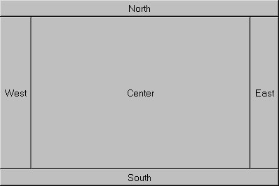
BorderLayout divides the container into 5 regions, and one component at a time can be placed in each
(that component can be another container, which itself can contain multiple components). If you add a component to a
region which already contains another component, only the latest component will be displayed. Components in the
North and South are placed at the top and bottom respectively, and are allowed to
be their preferred heights but are as wide as the container. East and West are on the
right and left sides respectively, and are allowed to be their preferred widths. Their heights stretch from the
North and South regions (if there is nothing in North or South,
they go from the bottom to the top of the container). Center fills the remaining space, left after the other
regions, in the middle. The component is stretched to fill this area.
How to add components to the regions of a container using BorderLayout is described above, in the first object of
this section. Note that if you don't specify a region, the component is added to Center. Therefore, for
example, if you create a frame (default layout is BorderLayout), and add a button to it using the default add(Component)
method, the button will fill the entire frame.
FlowLayout always allows components to be their preferred size [This is true even if the component is wider or taller than the container. A centered portion of the component is shown, with as much of the component being made visible as can be]. It places many components as it can on a line, with the first component starting on the left, until there is no more room horizontally, then it starts another line. By default the rows are centred in the container. You can specify how the rows are aligned using this constructor:
new FlowLayout(int alignment)
Constructs a new Flow Layout with the specified alignment and a default 5-unit horizontal and vertical gap. The value of the alignment argument must be one ofFlowLayout.LEFT,FlowLayout.RIGHT, orFlowLayout.CENTER
GridLayout divides its area into equally sized rectangles. When components are added to it, they are made the same size as their cell. Two constructors to be aware of are:
public GridLayout(int rows, int cols)Creates a grid layout with the specified number of rows and columns. All components in the layout are given equal size. One, but not both, ofrowsandcolscan be zero, which means that any number of objects can be placed in a row or in a column.
Remember: it is rows, then columns. If the number of components added is more than the number of cells (i.e. rows * columns) then more columns are added as needed, but the number of rows remains the same.
public GridLayout()Creates a grid layout with a default of one column per component, in a single row.
GridBagLayout
While it is not mentioned in the objectives, GridBagLayout is examined in SCJP 2.
There is a tutorial which includes using GridBagLayout, with AWT, at ftp://ftp.javasoft.com/docs/tut-OLDui.zip
GridBagLayout is like GridLayout, except that components can be different sizes (i.e. take up more than one cell in the grid)
and you have a lot more options, hence it is more complex. To use GridBagLayout, you create an instance, and set it as the
layout manager
for your container, as with the other layout managers. You don't specify the number of cells when constructing an instance
of
GridBagLayout, the constructor is just the default GridBagLayout().
The twist is that you specify how the component is to be displayed using an instance of GridBagConstraints. The fields in this class contain all the options. For each component, you use the GridBagLayout setConstraints() method:
setConstraints(Component comp,GridBagConstraints constraints)The values for each component are read from the GridBagConstraints object, so you can change the values after each component, and reuse the same GridBagConstraints instance for the next one. Then you add the component to the container e.g.
MyGridBag.setConstraints(componentX, MyConstraints);
add(componentX);
GridBagConstraints Fields:
[The constants (uppercase) listed below for use with certain fields are static fields in the GridBagConstraints class, so
you refer
to them as GridBagConstraints.EAST for example.]
anchor
This field is used when the component is smaller than its display area. It determines where, within the display area, to place the component.
one ofCENTER(default),EAST,WEST,NORTH,NORTHEAST,NORTHWEST,SOUTH,SOUTHEASTorSOUTHWEST)
fillThis field is used when the component's display area is larger than the component's requested size. It determines whether to resize the component, and if so, how.
one ofNONE(Default),HORIZONTAL,VERTICAL, orBOTH)
gridheightSpecifies the number of cells in a column for the component's display area.
UseREMAINDERto specify that the component be the last one in its column. UseRELATIVEto specify that the component be the next-to-last one in its column.)
gridwidthSpecifies the number of cells in a row for the component's display area.
UseREMAINDERto specify that the component be the last one in its row. UseRELATIVEto specify that the component be the next-to-last one in its row.
[HereREMAINDERacts somewhat like a carriage return. You add elements to the row, and when you useREMAINDERthat marks the end of the line, and then the next components are added to the next row. Look at the examples in the tutorial or in the JavaDocs. Alternatively, you can use gridx and gridy to specify grid position when adding a component.]
gridx, gridySpecifies the position of the component. The constantRELATIVE(which is the default) specifies that this component be placed next (i.e. to the right forgridx, and below forgridy) to the previously added component. The top left cell hasgridx=0,gridy=0.
insetsSpecifies the external padding of the component, the minimum amount of space between the component and the edges of its display
area.
This field belongs to the Insets class which uses the following constructor:
Insets(int top, int left, int bottom, int right)Creates and initializes a new Insets object with the specified top, left, bottom, and right insets.
ipadxSpecifies the internal padding of the component, how much space to add to the minimum width of the component.
ipadySpecifies the internal padding, that is, how much space to add to the minimum height of the component.
weightx, weightySpecifies how to distribute extra vertical/horizontal space respectively. This is a double, typically between 0 and 1, the default value is 0. If all the weights are zero, and there is extra space, all the components are bunched together in the middle.
©1999, 2000, 2002 Dylan Walsh.
Permission is granted to copy, distribute and/or modify this document
under the terms of the GNU Free Documentation License, Version 1.1
or any later version published by the Free Software Foundation;
with the Invariant Sections being the disclaimer,
no Front-Cover Texts, and no Back-Cover Texts.
A copy of the license is included in the section entitled "GNU
Free Documentation License".